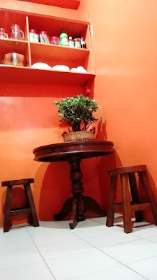
after we got rid of all the clutter, a well-loved table and chairs were placed at a corner to serve as a little eat-in. i opted for rounded furniture because they provide more move around space. this nook will be perfect for breakfast or just for reading.
i wanted our little kitchen to look spacious and airy, therefore open shelving is the only way to go. i also didn't put anything on top of cabinets for the same reason. besides, more storage will only result to more clutter. to keep the space from looking too contemporary, which is far from my design aesthetic, i mixed new with old and ikea with local goods.
the color palette for this kitchen renovation is very limited because i'm going for a monochromatic look. i picked davies only orange as base color to bring out all the brown in our wooden items. this will also help unify the kitchen to our dining and living area since we have an open layout. the granite counter top and backsplash are in glossy black to tone down the warmth of orange for good measure. also, the ceramic tile backsplash provides added texture as it resembles basket weave.
the microwave was placed inside the lower cabinet because we rarely use it. other least used kitchen accouterments were also hidden from sight to keep the space from looking too busy.
finally, here are the before shots.


No comments :
Post a Comment